Nachdenken über Zeichen und Schrift
Calligraphers
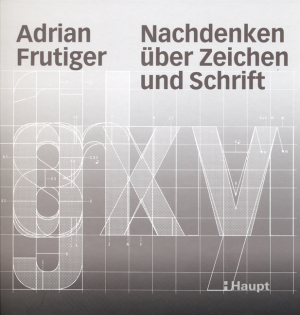
If you want to find your way around in the metro in Paris or in Charles-de-Gaulle Airport, follow his labeling system. Whoever drives through Switzerland reads his handwriting on all motorways. If you are looking for a clear, elegant and modern typeface, you will often choose "Univers": Adrian Frutiger, the great typeface designer of our time, shapes our everyday lives without us realizing it. In this book, Adrian Frutiger searches for the origins of signs and writing. He traces the development of writing, from the first traces in caves and on clay slabs to medieval calligraphy, from the invention of book printing with movable type to the emergence of modern sans serif typefaces such as Univers, Helvetica, Gil Sans" and the "Frutiger". He shows how great type designers of the 20th century shaped these developments and influenced and accompanied him and his work: Emil Ruder, Rudolf Hostettler, Herman Zapf and his two teachers Walter Käch and Alfred Willimann. The hand, the instrument to which people owe their development, runs like a red thread through the book. Adrian Frutiger dedicates the second part of his book to you, your hands. It is the commitment of an artisan who has always worked with the awareness of his two hands throughout his many years of professional life.
- Isbn 978-3-258-06811-4
- Ean 9783258068114
- Author Adrian Frutiger
- Editor Haupt Verlag
- Language de_CH